CSS size queries: components that respond to their own width
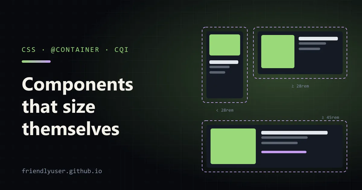
Media queries ask how wide the viewport is. That’s the wrong question for a reusable component: a card in a 300-pixel sidebar and the same card in a 900-pixel main column see the same viewport, but need different layouts. Container queries let a component ask how wide its container is instead. You mark an element as a query container with container-type, then write @container rules that apply to its descendants based on that element’s size.
Size container queries have been in every major browser engine since early 2023 (Chrome and Edge 105, Safari 16, Firefox 110), so they’re safe to use without a polyfill. The demo in this post was checked in Edge 158.
The two pieces
Section titled “The two pieces”1. Make an element a container. container-type: inline-size turns an element into a query container for its inline size (its width, in horizontal writing modes):
.card-slot {  container-type: inline-size;  container-name: card;}
/* The same thing with the shorthand: name / type */.card-slot {  container: card / inline-size;}
2. Query it. An @container rule applies when the nearest ancestor container (with that name, if you give one) matches the condition:
@container card (inline-size >= 28rem) { .card { grid-template-columns: 40% 1fr; }}The condition syntax is the same as for media queries. (min-width: 28rem) works too, and the range form (inline-size >= 28rem, 400px < width < 800px) reads better once you have more than one breakpoint. You can combine conditions with and, or and not.
The rule that trips everyone up at first: an element can’t query itself. The @container condition is evaluated against an ancestor, and the styles inside it apply to that ancestor’s descendants. That’s why the example puts the container on a wrapper (.card-slot) and styles .card inside it.
A card that switches layout
Section titled “A card that switches layout”Here is a complete page you can save as cards.html and open in a browser. The same card markup appears in a narrow sidebar, a wide main column and two half-width slots:
<!doctype html><html lang="en"><head><meta charset="utf-8"><meta name="viewport" content="width=device-width, initial-scale=1"><title>Card size queries</title><style>  body { font-family: system-ui, sans-serif; margin: 0; padding: 1rem; background: #f4f4f5; }  .layout { display: grid; grid-template-columns: 18rem 1fr; gap: 1rem; }  @media (max-width: 40rem) { .layout { grid-template-columns: 1fr; } }  .row { display: grid; grid-template-columns: 1fr 1fr; gap: 1rem; }
  /* 1. Make the wrapper a query container. */  .card-slot {    container: card / inline-size;  }
  /* 2. Default (narrow) layout: image on top. */  .card {    display: grid;    gap: 0.75rem;    padding: 0.75rem;    background: white;    border-radius: 0.5rem;    box-shadow: 0 1px 3px rgb(0 0 0 / 0.15);  }  .card .media { aspect-ratio: 16 / 9; border-radius: 0.25rem; background: #9ad97a; }  .card h2 { margin: 0; font-size: clamp(1rem, 0.75rem + 2.5cqi, 1.75rem); }  .card p { margin: 0; color: #52525b; }  .card .meta { display: none; }
  /* 3. 28rem and wider: image beside the text. */  @container card (inline-size >= 28rem) {    .card { grid-template-columns: 40% 1fr; align-items: start; }    .card .media { aspect-ratio: 1; }  }
  /* 4. 45rem and wider: fixed image column and extra metadata. */  @container card (inline-size >= 45rem) {    .card { grid-template-columns: 16rem 1fr; padding: 1.25rem; }    .card .meta { display: block; font-size: 0.875rem; }  }</style></head><body>  <template id="card">    <article class="card">      <div class="media"></div>      <div>        <h2>Card title</h2>        <p>Same markup in every slot.</p>        <p class="meta">5 min read · Updated 2 days ago</p>      </div>    </article>  </template>
  <div class="layout">    <aside><div class="card-slot"></div></aside>    <main style="display: grid; gap: 1rem;">      <div class="card-slot"></div>      <div class="row">        <div class="card-slot"></div>        <div class="card-slot"></div>      </div>    </main>  </div>
  <script>    const tpl = document.getElementById("card");    for (const slot of document.querySelectorAll(".card-slot")) {      slot.append(tpl.content.cloneNode(true));    }  </script></body></html>
At a 1400-pixel window, the sidebar card stacks its image above the text, the two half-width cards put the image beside the text, and the main column card also shows the metadata line. Make the window narrower than 40rem and the page switches to one column. At 560 pixels, the two full-width cards switch to the side-by-side layout without the metadata, and the two half-width cards, now much narrower, stack their images above the text. None of that comes from a media query in the card’s CSS.
The small script only clones the same card into every slot to keep the listing short, and the green .media block stands in for an image. Neither is needed for the queries.
Write the default styles for the narrowest case and let @container rules add layout as space allows. That way, the component still renders sensibly in a slot you didn’t plan for.
Container query units
Section titled “Container query units”Container queries come with length units relative to the query container:
| Unit | 1 unit equals |
|---|---|
cqi | 1% of the container’s inline size |
cqb | 1% of the container’s block size |
cqw / cqh | 1% of the container’s width / height |
cqmin / cqmax | the smaller / larger of cqi and cqb |
cqi is the one I use most, because it follows the writing mode and inline-size containers are the common case. It’s ideal for type and spacing that should scale with the component:
.card h2 { font-size: clamp(1rem, 0.75rem + 2.5cqi, 1.75rem);}clamp() keeps the text readable at the extremes, and the rem term keeps it responding to the user’s font-size setting. A pure cqi font size ignores that setting, which is an accessibility problem.
The units resolve against the nearest ancestor container of a suitable type, and they don’t need an @container rule. If there is no container at all, they fall back to the small viewport units (svw, svh, and so on). In a quick test in Edge, 10cqi on an element with no container ancestor came out at 10% of the viewport width.
cqb and cqh only mean something inside a container-type: size container, since an inline-size container doesn’t track its height.
Things that go wrong
Section titled “Things that go wrong”The container collapses to zero width. inline-size containment means the container’s width is calculated as if it had no content. That’s what makes the queries possible (otherwise, content that changes size based on a query could change the container’s size, which would change the query result, and so on). But in any context where the width comes from the content, such as a flex item with no flex-basis or width, an inline-block, a float or an auto-sized grid column, the container shrinks to almost nothing. In the test page, a container placed as the only child of a display: flex row collapsed to its padding, with the card’s text spilling out. Give the container a width from the outside: a grid track, flex: 1, or width: 100%.
container-type: size needs a height. Size containment applies in both axes, so a size container with no explicit height has a block size of zero. Use inline-size unless you really need to query height.
Nested containers and names. An unnamed @container (...) rule matches the nearest ancestor that is a query container, whichever that is. Once components nest (a card inside a grid that is itself a container), unnamed rules start matching the wrong ancestor. Name your containers.
Containers don’t affect themselves. You can’t change the container’s own layout from @container rules that query it. If the wrapper needs to change too, query an ancestor of the wrapper.
Style queries
Section titled “Style queries”The spec also has style queries, which test a computed style value instead of a size:
@container card style(--variant: featured) { .card { border: 2px solid #e11d48; background: #fff1f2; }}<div class="card-slot" style="--variant: featured">...</div>Browsers ship style queries for custom properties only; querying regular properties like style(display: flex) isn’t supported. Every element is a style container by default, so this needs no container-type. This worked in Edge 158 in my test page.
Browser support for style queries arrived later and less evenly than for size queries, so check Can I use for the browsers you support. They work well as a progressive enhancement: if the rule is ignored, the card keeps its default look.
Fallbacks
Section titled “Fallbacks”For browsers too old for size queries, the default narrow layout is already the fallback, which is one reason to write the CSS narrowest-first. If you need a wide layout for those browsers as well, use @supports:
@supports not (container-type: inline-size) { @media (min-width: 60rem) { main .card { grid-template-columns: 16rem 1fr; } }}Most sites can now skip this. Check your own analytics before deciding.
When media queries are still right
Section titled “When media queries are still right”Container queries are for components. Page-level layout, the decision to show a sidebar at all or switch a navigation bar to a menu button, still depends on the viewport, and media queries are the right tool there. So are user preferences like prefers-reduced-motion and prefers-color-scheme, which have nothing to do with size. In the demo, the media query decides the page grid and the container queries decide the cards.
Further reading
Section titled “Further reading”© 2026 David Li · Home · Blog · RSS ·Classic site · Built with Astro, Starlight and three.js · Logos:Font Awesome Free (CC BY 4.0)