The CSS :has() selector: styling parents and siblings without JavaScript
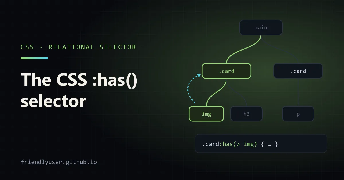
For most of CSS’s history, selectors could only look down and forward: you could style an element based on its ancestors or the siblings before it, never based on what it contains or what comes after it. :has() removes that restriction. .card:has(img) matches a card that contains an image, label:has(+ input:invalid) matches a label followed by an invalid input, and body:has(dialog[open]) lets the whole page react to an open modal.
Many things that used to need a class toggled from JavaScript (“add has-error to the wrapper when the input is invalid”) are now one CSS rule. :has() has worked in every major browser engine since December 2023. Every example below was checked in Chrome 156 on a test page.
How it reads
Section titled “How it reads”A:has(B) matches an element A if selector B matches relative to A. The argument is a relative selector, so it can start with a combinator:
.card:has(img) /* a card with an <img> anywhere inside */.card:has(> img) /* a card whose direct child is an <img> */h2:has(+ p) /* an h2 immediately followed by a <p> */h2:has(~ table) /* an h2 with a <table> somewhere after it among its siblings */The element that gets styled is still the one before :has(). You are not selecting the image; you are selecting the card, on the condition that the image exists.
:has() combines with everything else: :not(:has(...)) for the opposite, a comma-separated list inside for “any of”, and chaining for “all of”:
.card:not(:has(img)) { ... } /* cards without images */.card:has(img, video) { ... } /* cards with an image or a video */.card:has(img):has(.badge) { ... } /* cards with both */Form validation states
Section titled “Form validation states”Error styling is the most common reason to reach for :has(). The input knows whether it’s valid; the wrapper, the label and the error message don’t. Before :has(), you either wrote JavaScript to copy the state up to the wrapper, or ordered the HTML so the error came after the input and used input:invalid + .error.
<form id="signup" novalidate> <div class="field"> <label for="email">Email</label> <input id="email" type="email" required> <p class="error">Enter a valid email address.</p> </div> <div class="field"> <label for="name">Name</label> <input id="name" type="text"> </div> <button type="submit">Sign up</button></form>.field { display: grid; gap: 0.25rem; margin-bottom: 1rem; }.field .error { display: none; color: #b42318; font-size: 0.875rem; }
.field:has(input:user-invalid) label { color: #b42318; }.field:has(input:user-invalid) input { border-color: #b42318; }.field:has(input:user-invalid) .error { display: block; }
/* Mark required fields in the label, from the input's own attribute */.field:has(input:required) label::after { content: " *"; }
/* Dim the submit button while anything in the form is invalid */form:has(:invalid) button[type="submit"] { opacity: 0.5; }The rule that matters is :user-invalid rather than :invalid. :invalid matches an empty required field the moment the page loads, so every form would open covered in red. :user-invalid only matches after the user has interacted with the field and moved on, which is when an error message is actually useful. On the test page, the error stays hidden on load; typing not-an-email and pressing Tab shows it and turns the label red.
The required-field asterisk is a small example of a bigger idea: the HTML attribute (required) is the single source of truth, and the presentation follows it. No need to keep a class="required" on the label in sync.
The submit-button rule uses :invalid, on purpose: the button should look disabled until the form is complete, whether or not the user has touched every field. It’s only a visual hint. Keep the real validation on submit.
Cards with and without images
Section titled “Cards with and without images”Component CSS often has variants that depend on content: a card lays out differently when it has a thumbnail. With :has() the content decides, and no one has to remember to add card--with-image:
.card { border: 1px solid #ccc; border-radius: 8px; padding: 1rem; }
.card:has(> img) {  display: grid;  grid-template-columns: 120px 1fr;  gap: 1rem;  padding: 0;}.card:has(> img) > img {  width: 100%;  height: 100%;  object-fit: cover;  border-radius: 8px 0 0 8px;}
.card:not(:has(> img)) { border-left: 4px solid #6941c6; }<article class="card"> <img src="thumb.jpg" alt=""> <div><h3>With an image</h3><p>Two-column layout.</p></div></article><article class="card"> <h3>Text only</h3><p>Accent border instead.</p></article>The child combinator (> img) is deliberate. .card:has(img) would also match a card with a small avatar inside its footer, which is probably not what the layout rule means. Be as specific about the relationship as the design is.
Selecting previous siblings
Section titled “Selecting previous siblings”CSS has always had + (next sibling) and ~ (later siblings). There was no “previous sibling” combinator. :has() with a sibling combinator inside gives you one: A:has(+ B) is “an A that comes right before a B”.
Tightening the spacing between a heading and a subtitle:
h2:has(+ .subtitle) { margin-bottom: 0; }Only headings that are followed by a .subtitle lose their margin. The h2 followed by a regular paragraph keeps it.
The classic demo is a macOS-style dock, where the hovered item grows and its neighbours on both sides grow a little:
.dock { display: flex; gap: 0.5rem; list-style: none; padding: 0; }.dock li { transition: transform 0.15s; }.dock li:hover { transform: scale(1.4); }
.dock li:has(+ li:hover),   /* the item before the hovered one */.dock li:hover + li {       /* the item after it */  transform: scale(1.2);}
Quantity queries
Section titled “Quantity queries”“Style this list differently when it has six or more items” used to need JavaScript, or awkward nth-last-child tricks on the items themselves. With :has(), the container can ask how many children it has:
.tags { display: flex; flex-wrap: wrap; gap: 0.25rem; list-style: none; padding: 0; }
/* 6 or more items: switch to a three-column grid */.tags:has(> li:nth-child(6)) {  display: grid;  grid-template-columns: repeat(3, 1fr);}
/* exactly one item */.tags:has(> li:only-child) { font-weight: bold; }
The patterns generalise:
| Condition | Selector |
|---|---|
| at least N children | ul:has(> li:nth-child(N)) |
| at most N children | ul:not(:has(> li:nth-child(N + 1))), for example :nth-child(4) for “at most 3” |
| exactly N children | ul:has(> li:nth-child(N):last-child) |
| between N and M | ul:has(> li:nth-child(N)):not(:has(> li:nth-child(M + 1))) |
Page-level state
Section titled “Page-level state”Because :has() works on any element, you can anchor it on body or :root and react to state anywhere in the document:
/* Stop the page scrolling behind an open modal */body:has(dialog[open]) { overflow: hidden; }
/* A theme switch with no JavaScript */:root:has(#dark-mode:checked) {  color-scheme: dark;}
This is convenient, and it’s also where performance questions come from (next section). Use it for a handful of global states, not as a general replacement for classes.
The rules worth knowing
Section titled “The rules worth knowing”A few constraints that surprise people:
- No nesting.
:has()can’t appear inside another:has().document.querySelector(':has(:has(a))')throws aSyntaxError, and in a stylesheet the rule is dropped. - No pseudo-elements inside.
div:has(::before)is invalid. You can’t select based on generated content. - Unforgiving argument list. One invalid or unsupported selector in the list invalidates the whole
:has(), unlike:is()and:where(), which skip the bad entry.div:has(a, :unknown-thing)is a syntax error. If you mix in something new, wrap it::has(:is(a, :new-thing)). - Specificity is that of the most specific selector in the argument, the same rule as
:is()..card:has(#hero)has the specificity of a class plus an ID.
Performance
Section titled “Performance”Any selector costs something when the DOM changes, and :has() costs more than most, because a change deep inside an element can change whether an ancestor matches. Browsers do a lot of work to limit what they re-check, and for typical component-level use (.field:has(input:user-invalid), .card:has(> img)) you won’t notice anything.
The patterns that make the browser’s job harder, and that are worth avoiding on large or frequently changing pages:
- Broad anchors with descendant arguments.
body:has(.selected)or*:has(...)means any change anywhere in the page may need re-checking against the root. Anchor on the smallest element that works, and prefer the child (>) and sibling (+,~) combinators over plain descendant matching. - Arguments that match very often.
:has(:hover)on a big container re-evaluates on every mouse move. - Using it as a state store. If JavaScript already knows the state (a menu is open), setting a class or attribute on the right element is cheaper and clearer than inferring it with
:has().
If a page with heavy :has() use feels slow, the Performance panel in Chrome DevTools shows time spent in “Recalculate style”; that’s where these costs appear.
Browser support
Section titled “Browser support”:has() shipped in Safari 15.4 (March 2022), Chrome and Edge 105 (August 2022), and Firefox 121 (December 2023). That last release made it Baseline in December 2023, and since mid-2026 it counts as Baseline “widely available”. :user-invalid has been Baseline since late 2023 as well.
If you support older browsers, treat :has() styles as enhancements and feature-detect where the fallback matters:
.card { padding: 1rem; }
@supports selector(:has(*)) {  .card:has(> img) { display: grid; grid-template-columns: 120px 1fr; padding: 0; }}
From JavaScript, CSS.supports("selector(:has(*))") returns the same answer.
Further reading
Section titled “Further reading”© 2026 David Li · Home · Blog · RSS ·Classic site · Built with Astro, Starlight and three.js · Logos:Font Awesome Free (CC BY 4.0)